Home
- Intro
- Above the fold
- Below the fold
- Value-based messaging
- Objection handling
- Better CTAs
- Tech tips
- Design & branding
- Bonus tips
- Summary
Your landing page needs help...
Let me guess.
You're a founder.
You're getting pretty decent traffic to your landing page.
But you aren't making many sales.
Why?
Simple. Your landing page makes some really bad mistakes.
They're the same mistakes I made as a founder, and you'll find hundreds of founders making them every day (for example, on Indie Hackers).
Luckily, it's easy to avoid these mistakes if you know what to look out for!
So if you want...
- ... a better conversion rate
- ... more signups
- ... more sales
You can use this checklist and be more successful, faster.
Within 10-15min, you'll be ready to make way more 💰 through your landing page.
It isn't uncommon for founders to increase their conversion rates by over 200% with just a few quick tweaks.
If you're wondering why you should listen to me, here are my credentials:
- I've founded and sold multiple startups. Some bootstrapped, one investor-backed.
- Landing pages I created have sold $millions of product.
- Smart companies pay me a lot to improve their landing page conversions. Mainly using personalisation and social proof.
If you need, you can find out a bit more about me here:
I have a standing invitation to help anyone struggling with marketing, sales or being a founder. If that's you, get in touch.
Otherwise, let's move on to the first point on the checklist.
Do you win above the fold?
Above the fold is an old term from the newspaper industry. It basically means "the bit of a newspaper that's instantly visible to people when it's folded on a newspaper stand."
Newspaper editors were on to something important.
They knew that people glancing at the newspaper stand had short attention spans. The content "above the fold" needed to instantly make the reader want to find out more (and hence open/buy the newspaper).
The same applies to your landing page.
For your landing page, "above the fold" means the hero section - the bit of your landing page that visitors see instantly without scrolling.
When a visitor lands on your page, you have ~ 3 seconds to get them interested. The best way to do this is by making it really, really obvious what value your product will provide to the visitor (or what problem you'll solve for them).
The best way to do this is by making it really, really obvious what value your product will provide to the visitor (or what problem you'll solve for them).
Don't nail the value, and your visitor will probably get distracted by Slack/their children/Youtube and leave your site.
Assuming the visitor does understand the value they'll get from your product, you then have maybe ~ 10 seconds to make it super obvious to the visitor (on a very high level) how you'll create that value for them.
This should be done in really simple language that your grandparents would understand.
If the visitor doesn't understand how you create value for them (ie what your product does), they won't trust you and will leave. Images (eg screenshots) can be helpful here, but are often more of a distraction.
Let's say you managed to get a visitor interested in the value of your product and they understand roughly what it does...
The last, crucial step is to get the visitor to take whatever action you need them to take to become a customer.
We do this with a CTA (call to action). This could be a button leading to the pricing page, an email-capture form, or whatever action you need the visitor to take.
To summarise, check if your landing page does the following above the fold (in order of importance):
- Makes it super obvious what value I will get from the product
- Makes it really easy for me to understand what your product does
- Gives me a single positive action to take (in order to become a customer)
Nail these three points, and your landing page is already in the top 10%.
Next, we'll look at common mistakes you might be making below the fold.
Below the fold
Above the fold, there's pretty much a straightforward way of getting the best results (what we just talked about in the previous chapter).
Below the fold though, things get complicated.
Some products need a lot of explaining. Others rely on videos and images (especially physical products).
You'll have to work out what your landing page needs on your own (and by listening to questions you get from prospective customers).
There are some universally important things your landing page needs if you're going to use it to make money though.
Here's a list of questions to ask yourself:
Would it convert me as a text doc?
It's easy to get caught up in pretty designs and images when putting together your landing page. Optimise for sales not design-awards by making sure the design supports the content, not the other way around.
An easy way to do this is by copying all of your text into a plain text file and seeing if it a) makes sense and b) would convince you to buy. No? Then change it!
Do I understand the value?
If you want me to buy your product, I need to understand the value of your product.
After reading your page, would I understand how my life will be better after buying your product?
Another way to think about this (especially in B2B) is to ask yourself if I (the visitor) understand the problem you're solving for me...
Do I believe you can provide the value?
If you think about it, there's no reason I should care if your product is a web app, mobile app, or a live-in butler called Gregory.
Either it provides value to me (at an acceptable price) or it doesn't. Simple.
That said, I do still need to believe that your product can provide the value promised. Otherwise, I'm hardly likely to pay you money, right?
Make sure I believe your product can solve my problem by ensuring I understand how your product provides that value.
You don't need to go super deep - just enough that I'm confident you aren't selling me pixie dust.
Do I trust you to provide the value?
It's not enough for me to understand the value you provide and believe your product can do it.
I still have to trust you to do so.
Does your landing page convince me that you're a safe pair of hands? That I'm not just throwing away money and embarrassing myself in front of my boss?
If not, have a think about how/where you can build social proof into your landing page to solve the problem.
My free social proof cheatsheet is a great place to get started...
Is it easy for me to take the next step?
Your CTAs should make it obvious and easy for me to move through your funnel and become a successful customer.
Check your landing page and make sure your CTAs aren't competing for attention and you don't have any unnecessary friction (eg useless form fields).
Satisfied? Then let's move on to the single biggest mistake founders make...
Value-based messaging
Bad news - your landing page probably focusses on product functionality, not value to the customer. For some reason, technical founders seem especially likely to fall into this trap.
This mistake is deadly - but the good news is it's easy and quick to move from product to value based messaging.
And doing so could easily double your sales overnight.
I'll come back and do a special write-up on how for this checklist but, for now, you can use this how-to guide in my recent blog post, here.
Poorly performing, product-focussed headline. I'm not instantly excited.
Much better, value-based headline. I instantly understand why I need your product.
Does your landing page now make the value so obvious that your visitors do this?
via GIPHY
Great, then let's move on to talk about objection handling.
Efficient objection handling
Whether you're in a sales meeting or pitching investors, there's one rule that holds true:
The more you say, the more likely it is you'll say something the other person disagrees with.
And that's a sure fire way to lose out on deals.
Of course, saying too little is no good either.
So how can we find a middle ground where our landing page says enough to make as many potential customers as possible convert, without saying too much and putting them off?
Simple - by focussing on overcoming customer objections.
There's a lot of theory on this topic.
But customer objections are basically nothing more than reasons why a customer isn't ready to buy your product yet.
They can range from the broad and super important "I don't understand what the product does," to the niche "this product doesn't seem to work for { obscure use case } ."
As a founder, you should have a concrete list of customer objections and how common/important they are.
If you don't know this information, you need to go out and talk to potential customers. Your landing page won't be effective until you've had more customer contact.
Once you have a list of common/important customer objections, you should make sure a) all of these objections are handled by the content on your landing page, and b) your content is written/displayed as a direct/obvious solution to these objections. Talk to your customers, not at them!
Nearly all of the remaining content on your site can be removed. It's probably doing more harm than good.
As a rough benchmark, I cut 40-60% of the text volume from my first landing page draft to the 'live' version.

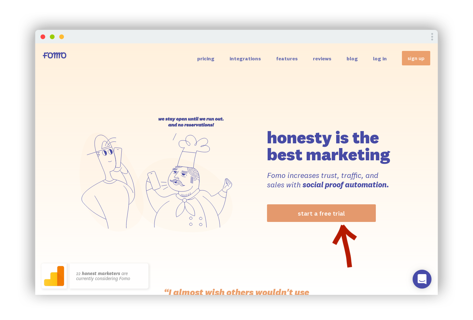
The FOMO landing page does a great job of using every bit of copy to target customer objections directly. Note how the FOMO team knows exactly which objections are most important, and slips between seemingly technical/minor objections ("do you integrate with X") and major objections ("will I make money with this?") seamlessly. There's no 'dead weight' copy on their page at all.
Is your landing page now efficient and targeted solely at turning your customers' objections into 💰 ?
Then let's move on to talk about CTAs.
Crafting a better CTA
When a visitor comes to your landing page, there is a series of actions you want them to take to become a successful customer.
What those actions are varies from product to product. But in nearly all cases, there will be one main action/step you want the visitor to take.
A common main action might be to subscribe to a waitlist, or book a demo.
A CTA (call to action) is an element on your landing page which facilitates and encourages the visitor taking that action. Often, it's a button or input field.
Optimising your CTAs should increase your conversion rates.
Basically, you want as many people as possible using your primary CTA.
Any potential customers who aren't ready to convert yet should see use secondary CTAs which will help them overcome their objections.
Here are a few pointers to make sure your CTAs aren't leaving money on the table:
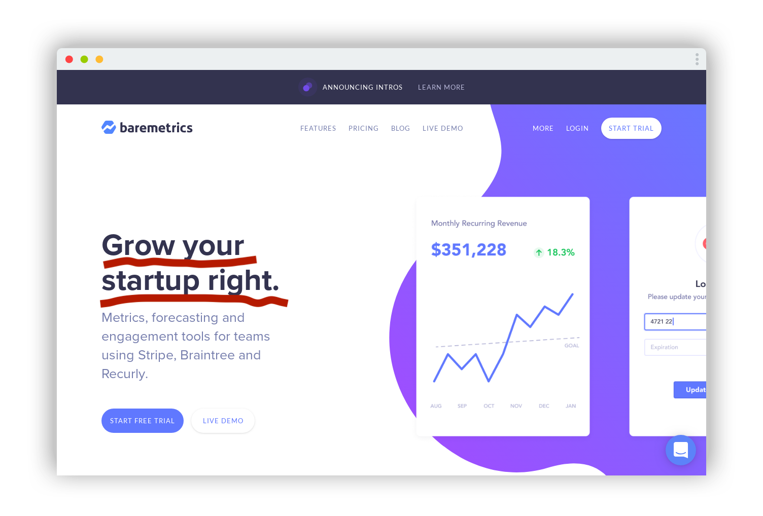
Is your primary CTA unmistakable?
Your primary CTA should be super easy for visitors to find. Too many competing CTAs (2 at most ideally) and you'll be losing out on potential customers because they didn't know what to do...
Super clear, obvious primary CTA by FOMO (notice the secondary CTA is actually the same as the primary).
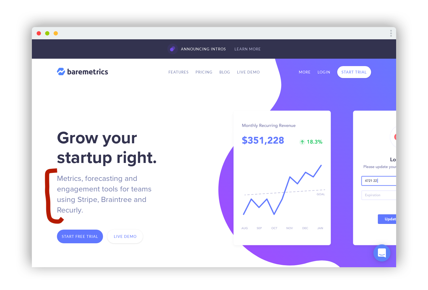
Do you have 'escape chute' CTAs?
Escape chute CTAs (or secondary CTAs) are for people who aren't quite ready to take the primary CTA yet. You can use them to funnel uncertain visitors towards leaving their contact details or more objection-handling content.
These secondary CTAs should be used sparingly and should never take focus away from the primary CTA.
Exit intent modals, subtle buttons and 'hiding further below the fold' are good ways to display a secondary CTA.
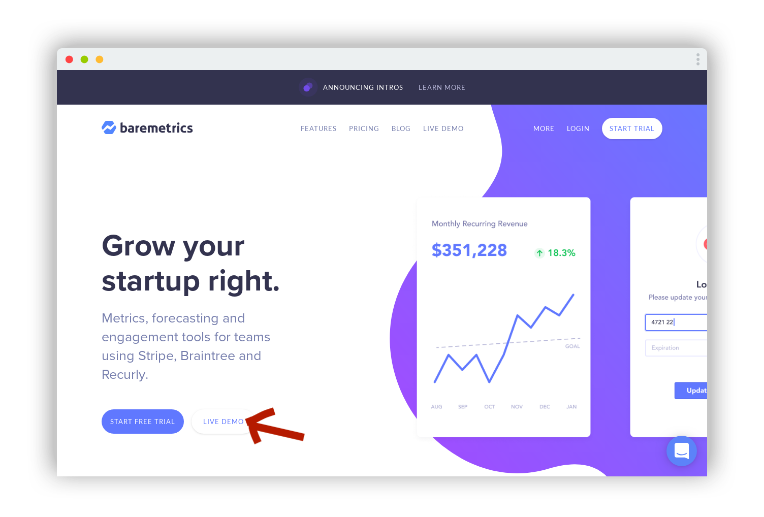
This subtle secondary CTA doesn't draw attention away from the primary CTA, but makes sure Baremetrics doesn't lose potential customers who aren't quite ready to sign up yet.
Do your CTAs excite me to action?
Your CTAs should be to the point and easy to understand.
Yet they should also be addressed to me directly and excite (or animate) me into taking the action. Think "join us now" vs "join" Or "start growing" vs "subscribe."
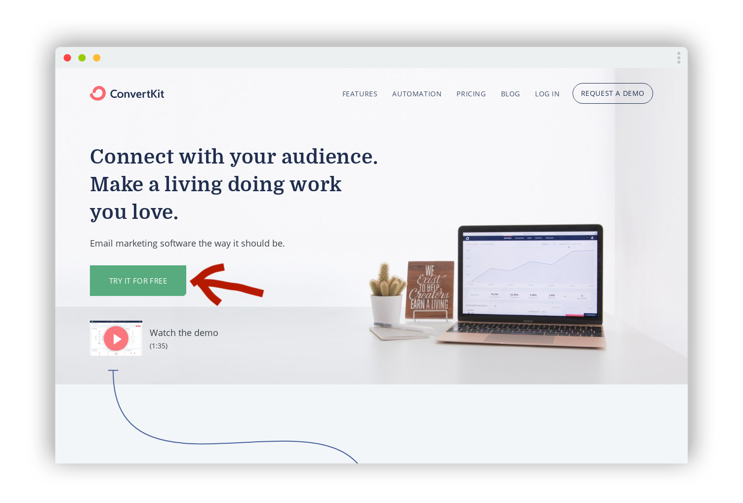
ConvertKit's primary CTA is short and snappy, but exciting. It adds urgency and asks "what are you waiting for? You could be using this today for free!"
Can I always find a CTA?
Many landing pages simply don't have their primary CTA displayed often enough...
They'll show it in the hero section, then again in a pricing section at the bottom of the page.
The visitor is ready to sign up on any other section of the page? Tough luck - they'll have to go hunting for that sign up button. And adding unnecessary work for visitors to convert is (almost) never a good idea.
Happy with the conversion power of your CTAs?
Then let's move on to talk about technical basics.
Technical Tips
The truth is, the technology decisions behind your landing page won't play a significant role in how many sales you make during the early-ish days.
The content and copy is much, much more important.
That said, there are a few technical/behind the scenes quick wins you'll want to get right.
You should avoid these common mistakes:
Do you have an SSL certificate (working)?
I don't think I should have to say anything more about this. It's 2019 guys. Get it sorted.
Are your images/videos a reasonable size?
There's no need to go crazy with optimising every image for a fast page load. But loading 5mb images is a no-no too.
I shouldn't have to wait for your landing page to load. And visitors won't.
Do you have your analytics/tracking pixels set up?
In the early days, using a Facebook tracking pixel for marketing (or Google Analytics for that matter) won't be high on your list of priorities.
But at some point you will want that data, so better to collect it from day 0. After all, installing only takes a few minutes.
Are your meta/social tags on point?
If you want to make money, you want people to share your landing page.
And if you want people to click on those shared links (for example on Twitter), you'll be much happier if your open graph social tags are set up correctly.
Imagine how many more people are going to click the link now that it has a photo and description visible...
Ok, those are the easy tech wins sorted.
Let's move on to some design/branding fails.
Design & branding
The points in this checklist are ranked in order of most to least important topics you should spend time on to increase your revenue.
You might be surprised that design and branding is one of the last points on the list.
But you shouldn't be.
The painful truth is, in the early days, your content is way, way more important than your design.
In fact, the only job your design/branding needs to do is get out of the way and make it easy for visitors to read your content, understand the value of your product, and give you money.
That's why I recommend writing the copy for your site first, then designing the look and feel around it.
Let's look at some of the most important checks you should make:
Do your images/videos help or distract?
For some reason, founders often think their site 'needs' images.
But the truth is, more often than not they're a distraction and don't add anything to your conversion rate.
Take a look over your images/videos and, for each one, ask yourself if they a) help solve a customer objection, b) increase customer trust, or c) increase the perceived value of your product (more likely in ecommerce).
For any images that fulfil none of these three requirements, either replace with images that do, or just get rid of them completely.
Is your page easy to read?
Your typography and colour palette only needs to do three things...
- ... make sure everything is legible
- ... draw my attention to the important stuff
- ... look good enough for me to trust you
That's really simple stuff.
But you'd be suprised how much time you could waste on perfecting bits of your design that nobody cares about.
Just get out and do some sales instead!
Let's move on to some bonus tips.
Bonus Tips
Congrats - you've made it to the final chapter 🚀
The points we've looked at so far are really, really important.
They're the basics you need to get right.
Mess that up, and you're leaving money on the table.
In this chapter I've put together some bonus tips I used to make $millions in sales.
You can use them to boost your sales as well...
... but make sure you've got the basics right first.
Social proof
We already touched on social proof in an earlier chapter.
But the truth is, getting this right is one of the easiest ways to boost your conversion rates by ~10% overnight.
You can use my free Social Proof Cheatsheet to get started.
Personalisation
You can easily double your sales by personalising your content to your audience.
I do this as a consultant for startups regularly. And even bigger companies see massive revenue increases with just a few hours work.
Here's a great starter guide to personalisation by Brennan Dunn.
More bonus tips coming soon
I'm constantly adding bonus tips to this checklist. If you have a suggestion, please shoot me an email!
Finally, let's wrap things up...
Summary
You came here because your landing page wasn't delivering.
After going through the checklist, you should now have...
- ... a better conversion rate
- ... more signups
- ... more sales
But that's just the start.
There's a lot more to building a successful business than a decent landing page.
And I should know...
I've founded and sold several companies of my own. And helped hundreds of founders like you do the same.
If you'd like to grow and make more sales, faster, get in touch for a consulting session.
For lower touch, practical advice and discounts, you can join 3'000+ founders for my weekly newsletter.
As always, I have a standing invitation so please reach out with feedback, questions or just to say hi. I love helping founders and I'd love to help you.